




Designing a variable typeface inspired by Apollo 11, Bell telecommunications, and nature.
Blush
- Date
- Jan 2020 – Present
- Topic(s)
- Typeface design
- Summary
- In the 1970s, Matthew Carter cut ink traps into Bell Centennial so phone-book type would survive cheap newsprint. Blush is a variable typeface that began with the Futura on the Apollo 11 plaque, with…
For forty years, AT&T’s directories were set in Bell Gothic, a sans-serif built for tiny type on cheap, absorbent newsprint drawn for Linotype presses. When the company moved to offset printing and CRT typesetting, the letters started to erode, especially in the lighter weights.1 Printers added more ink to compensate, but that just made the type harder to read.
Because of this, AT&T brought in typeface designer Matthew Carter. His fix sounded backwards at the time: cut deep notches into the letters where strokes meet. When the ink spreads into the paper fibers, it fills the notches instead of the counters, and what’s left on the page is a clean letter.2 The notches are called ink traps. The Bell Centennial typeface was designed with these ink traps and shipped in 1978, AT&T’s hundredth anniversary.
I’ve been drawing a typeface called Blush on and off for a few years. It started somewhere else entirely: the plaque Apollo 11 left on the moon in 1969, set in Futura.
In 1924 Paul Renner was commissioned to design “the typeface of our time,” and Bauer released Futura in 1927. By the 1960s it was so common that setting the moon plaque in it was almost a default choice.3
I wanted that geometric familiarity, but softer and less stark. What began as a single weight drawn in Glyphs is now a variable font with four axes. Any weight can be condensed, made taller or slanted, and every setting in between is available.
Weight runs from 200 to 900. Width condenses to 75%, and those are all honest percentages: a condensed letter is about three quarters as wide. Height is a custom axis that makes letters up to 25% taller while horizontal strokes keep their thickness. Slant leans everything by up to 10°.
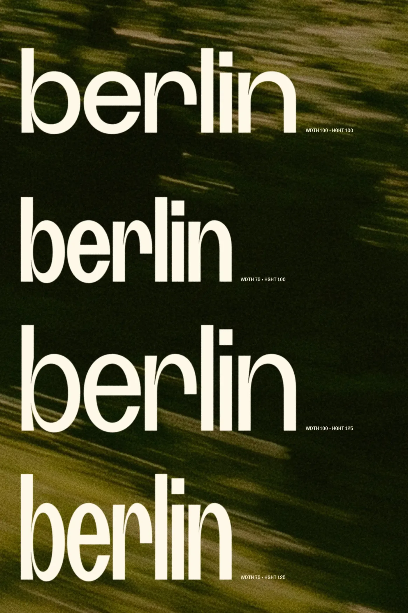
Going back to the ink traps, Blush has a lot of them.
They take a few forms: tapering slivers where an arch meets a stem (n, h, m, a, b, d), long slits in the crotch of diagonals (V, W, M, N), notches where arms meet a stem (K, R), and hairline cusps at the waist of B, 3 and 8.
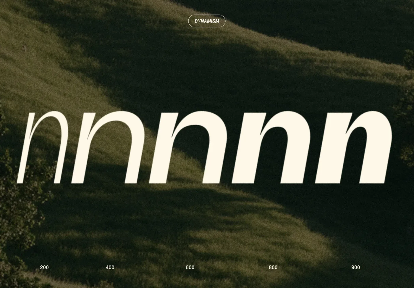
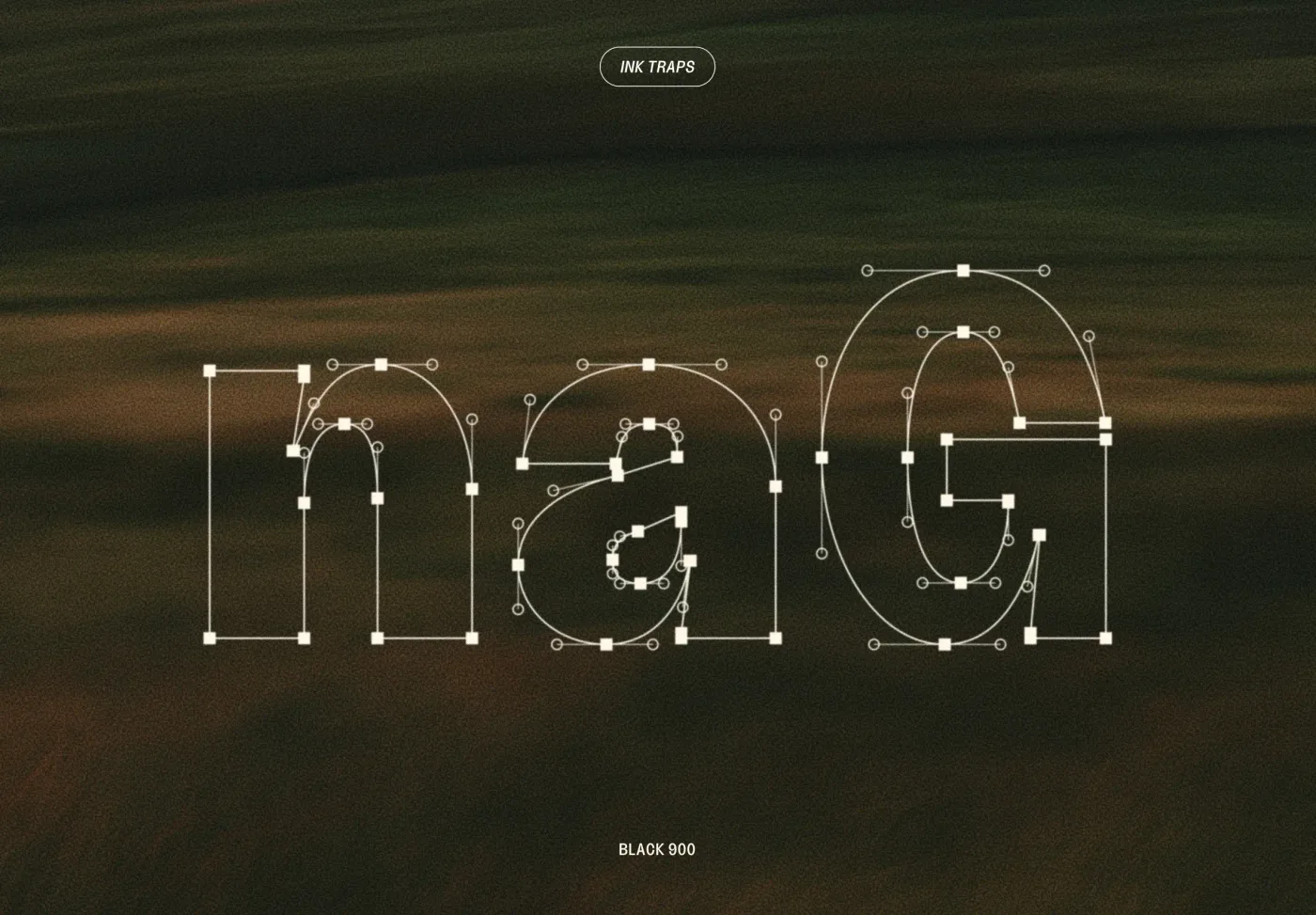
The traps scale with weight. At ExtraLight they’re barely there; at Black they open into wedges that keep heavy joins from clogging. The heaviest traps on n, a, B and G were tuned by hand against reference drawings.
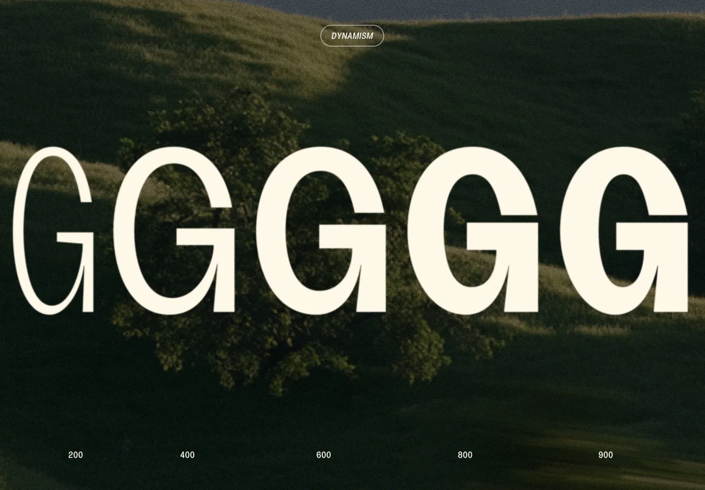
So why draw ink traps into a typeface that will mostly live on screens? Almost nothing set in Blush will ever touch newsprint, and on a screen there’s no ink to trap. At the heavy weights, the traps still do a version of their old job, keeping dense joins from turning into dark blobs. Everywhere else, they’re doing what Bell Centennial’s did at large sizes: showing.
A fix for a 1970s printing problem turned into a detail you can spot from across the room. That’s the part I like. The reason went away, and the shape stayed.
The rest is the slow work. Two asterisks, a six-spoke and an eight-spoke, are built to match the letters, with tapered spokes and square-cut ends, and they respond to every axis. Kerning and f-ligatures (fi, fl, ff, ffi, ffl) round out a set of 103 glyphs.
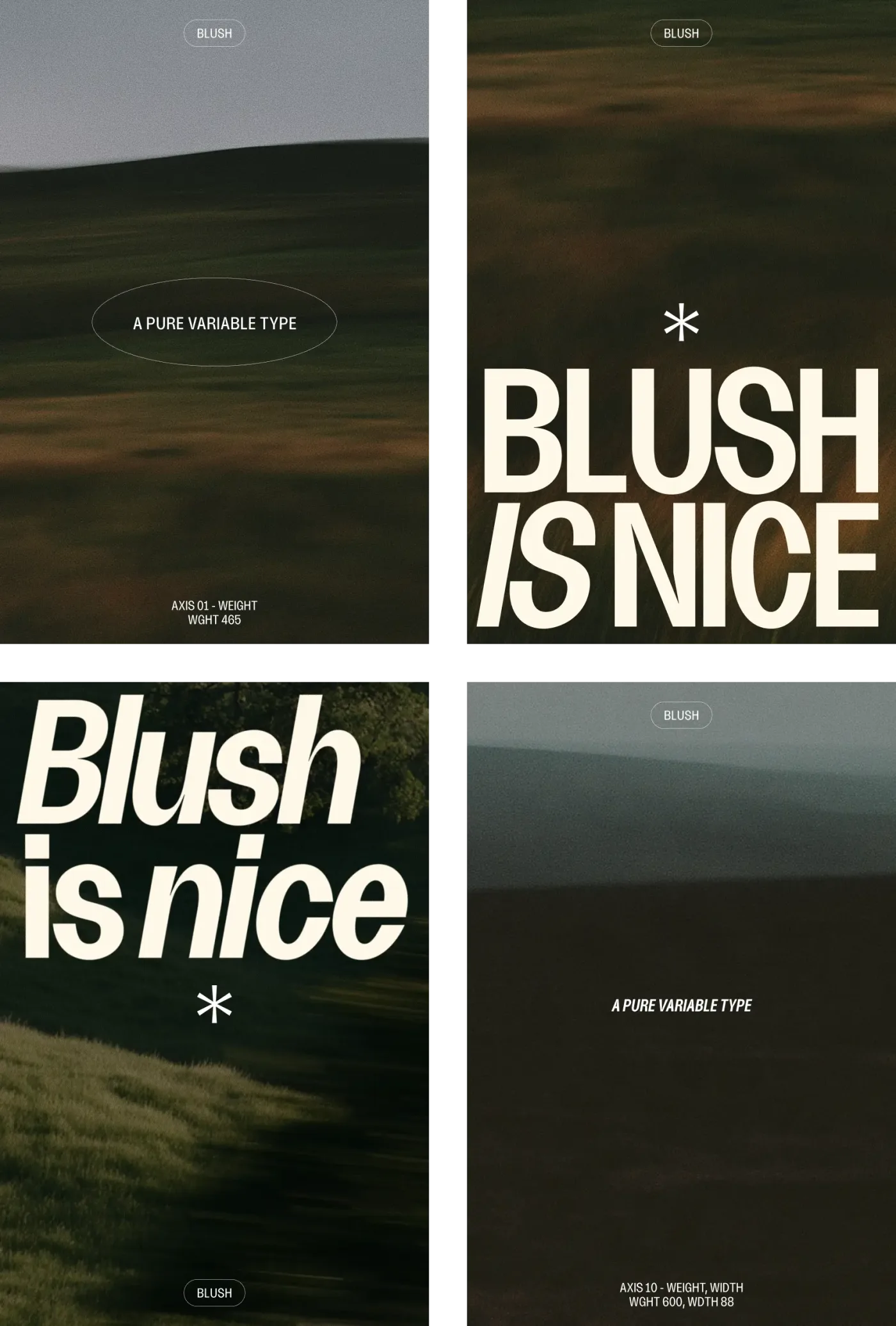
It’s still a work in progress. Next up are fuller punctuation, accented letters, and a close look at the glyphs that were placed by rule rather than by hand.
So if you zoom in on an n and find that little notch, that’s what it is: a note left for a press that isn’t coming.
P.S. this site was partially set in Blush.
Footnotes
1Bell Gothic, offset presses and CRT typesetting: MoMA gallery label for Bell Centennial, Standard Deviations (2011).
2Ink traps filling in on newsprint, and staying visible at large sizes or on coated paper: “Bell Centennial,” Wikipedia.
3Futura’s commission and release: AIGA Eye on Design, “Happy 90th Birthday to Futura.” Futura’s ubiquity by the Apollo era: Douglas Thomas, Never Use Futura (2017).
The ideas and opinions in this post are mine. Claude helps with research.