Working with a fellow staff designer we created multiple product experience visions showcasing work across domains, via scenario writing, storyboarding, prototyping, and testing. With the company's annual strategy defined by senior leadership (called "Big Bets"), we scoped focus to support that direction and lay the runway for product and design, influencing near-future roadmaps.
↬ Where did we start?
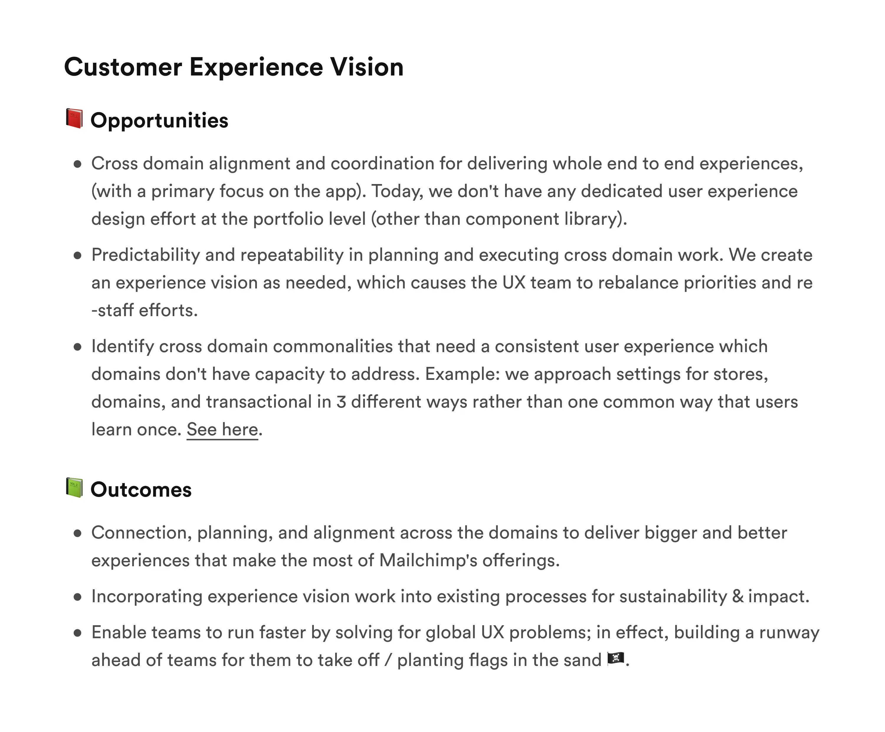
① Because conceiving an experience vision was uncharted territory for Mailchimp, we began by outlining our approach and identifying key challenges to address. We aimed to develop a clear plan, gathering insights from stakeholders and mapping out strategic steps. Below is a sample from our shaping document, highlighting the considerations we made:
↬ What did we do?
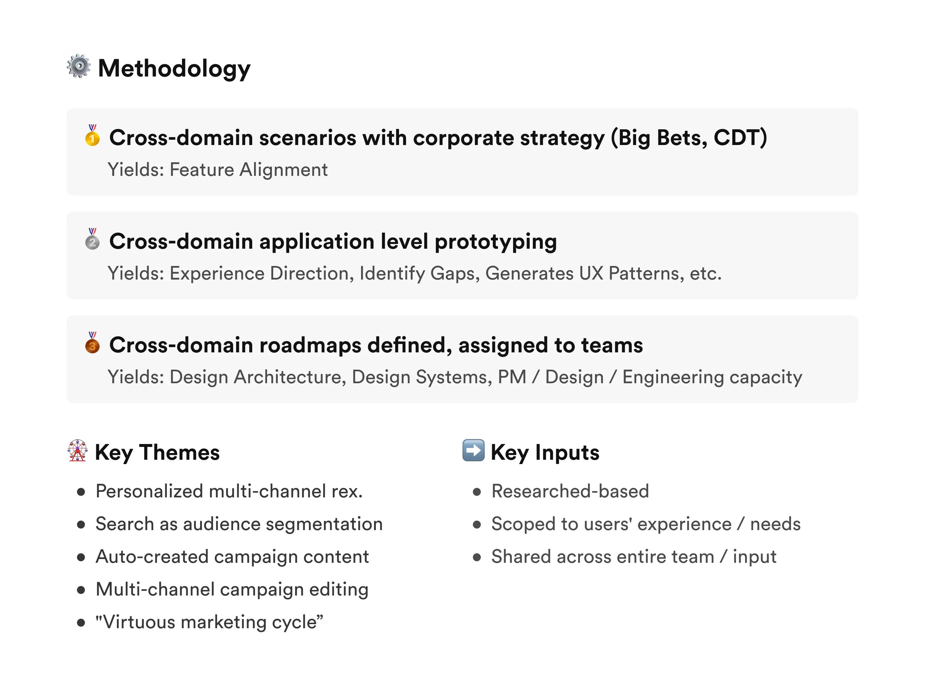
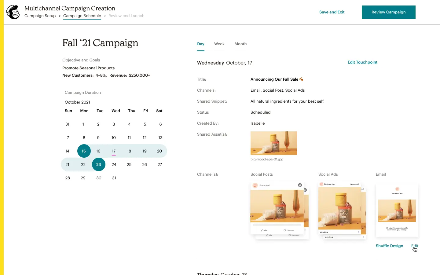
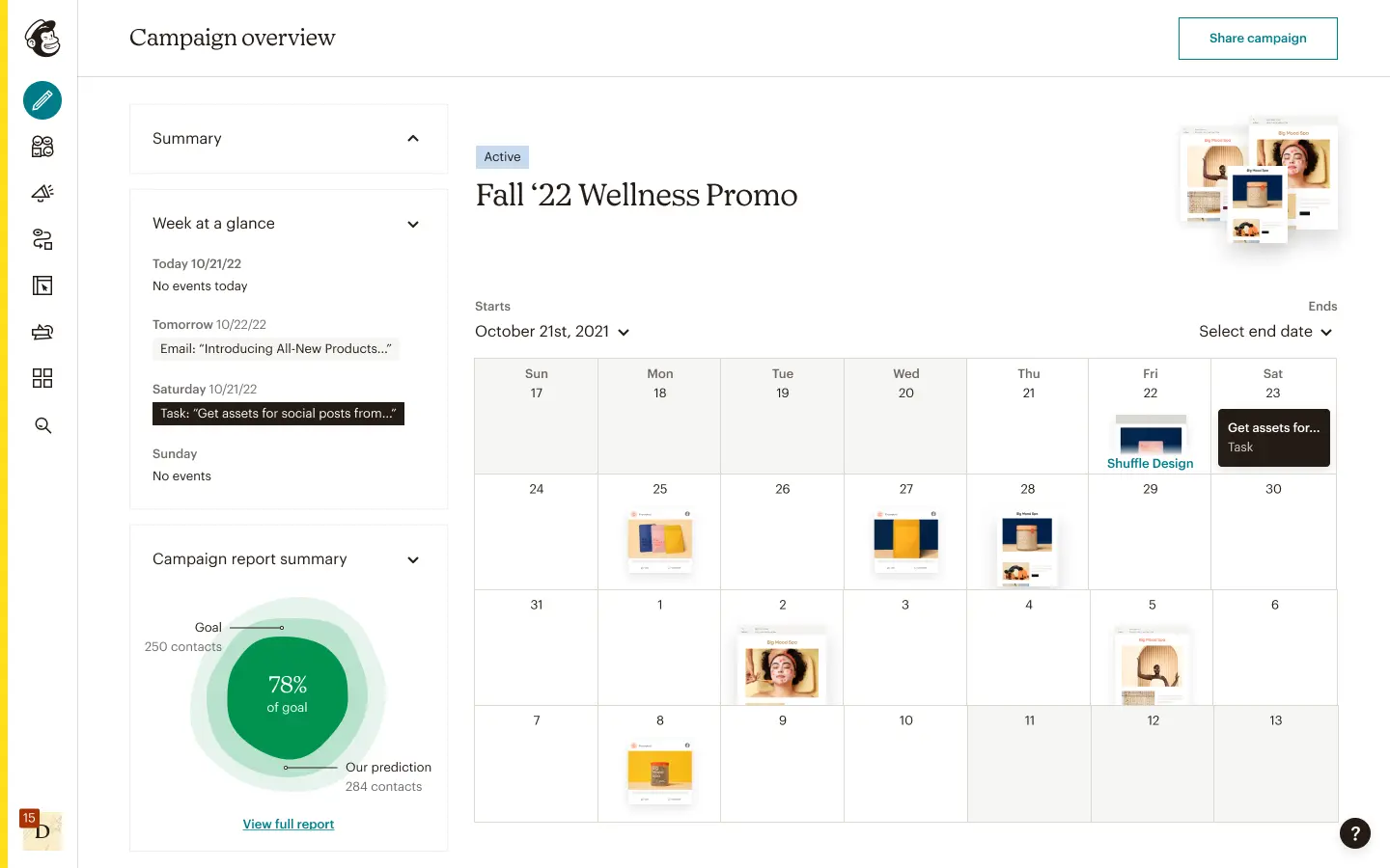
② After creating some definition for the epic, we started writing scenarios and mapping core journeys. These were used as foundations so design could be executed at a higher fidelity to articulate the experiences.
The deliverables for these experience visions were first high-fidelity screens in Figma, with the ultimate artifact to be a React prototype for user testing. So in short: Words → Figma → React; then we’d synthesize our learnings for future work.
↬ What difference did we make?
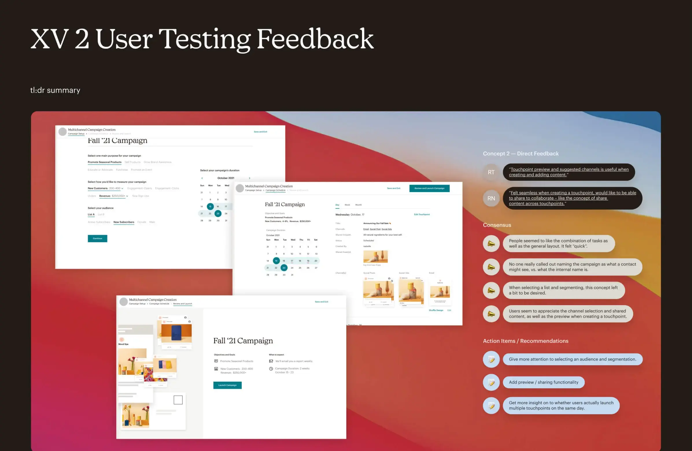
③ After running moderated and unmoderated tests, we gathered data from what worked well and what we could improve upon. I then synthesized what we found so it could be shared with leadership and the rest of our design and product peers for roadmap planning.
All in all, the new prototypes we tested were net positive in terms of usability and overall direction. When trying to raise the bar for metrics like CSAT, HEART, etc., listening to prospective and current customers is vital for improving experiences.
These prototypes planted a flag for product teams to use as a direction, guiding their development efforts and ensuring a cohesive vision across all stages of production.
