Design systems can be great—they're useful for both new and seasoned designers. They help refocus design efforts from mundane things like styling inputs and buttons, to more exciting challenges like interaction and prototyping. However, knowing how to use the system is probably just as important as the system itself. While working on the design architecture team, I helped plan and facilitate workshops for all of product design and (some of) engineering to learn how to use Mailchimp’s design system.
↬ Where did we start?
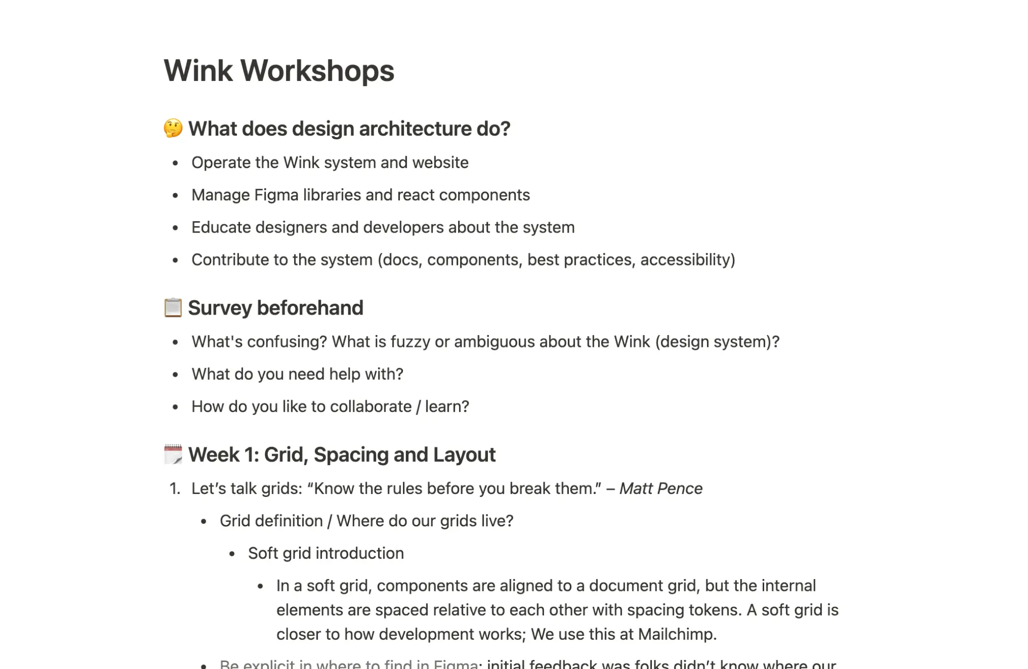
① As with most projects, a good first step is to define the problem. Being one of five on the design architecture team, we noticed designers had problems finding resources around the design system (Wink), how to use it, and how to contribute to it. As a group, we thought workshops would be a good way to mitigate some of these issues.
We began planning and documenting how the workshops might be conducted, how we should split the presentations / activities up, and how we could create a living document in the system around education.
↬ What did we do?
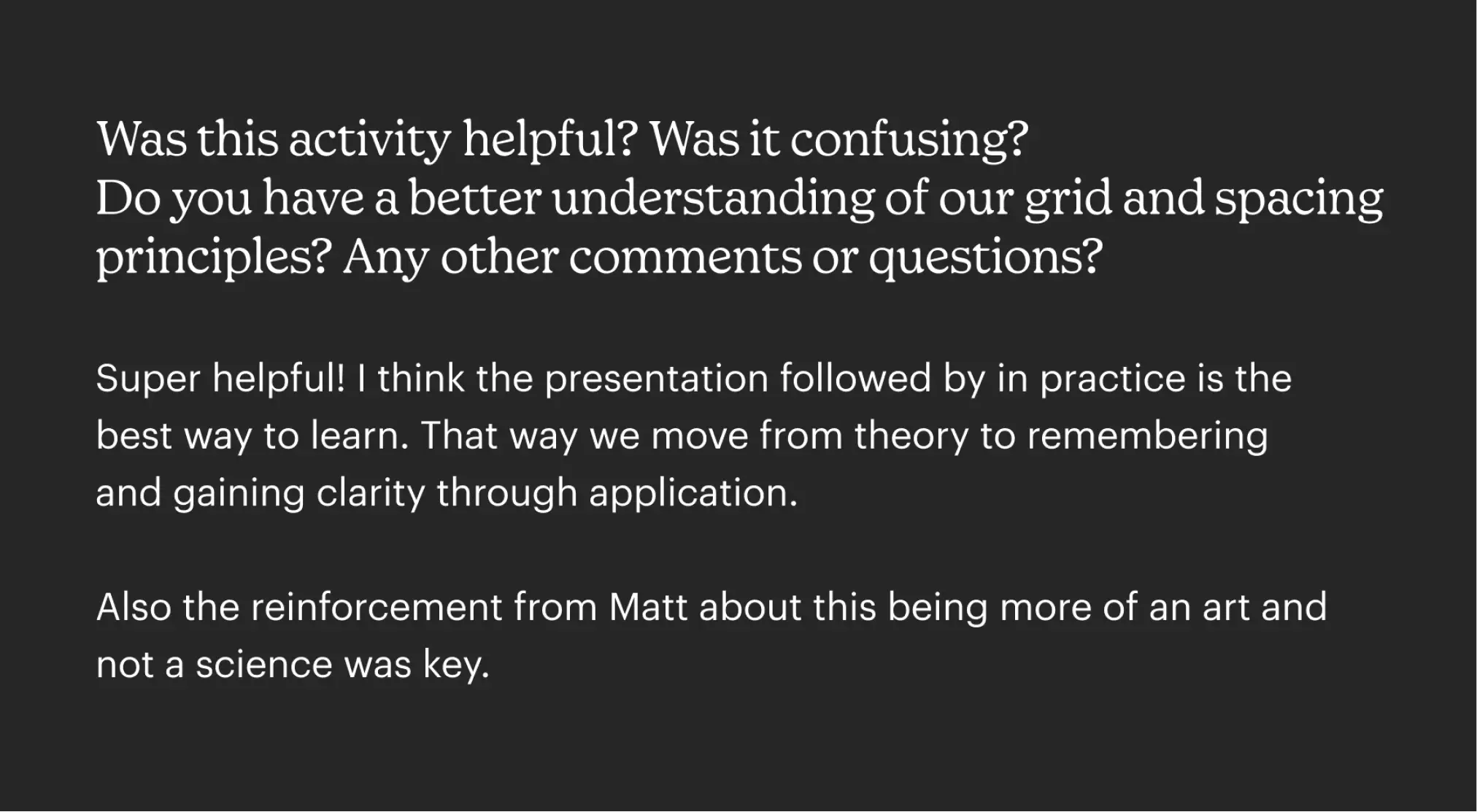
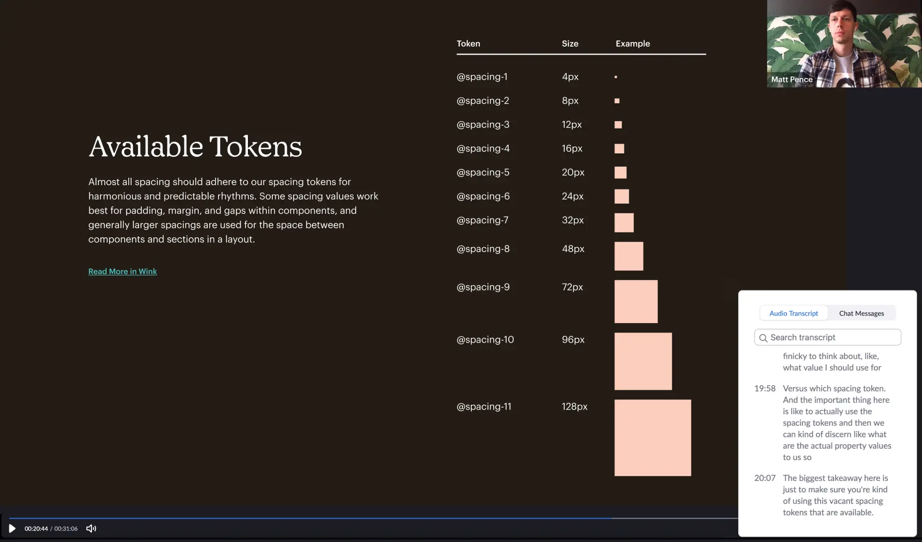
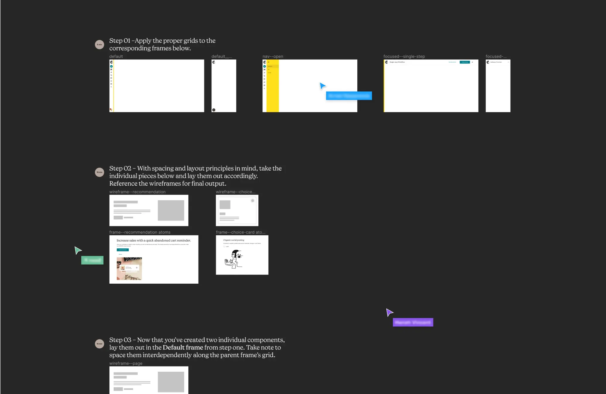
② It seems obvious, but hammering home fundamentals was a big deal for week 1 of the workshop. Mailchimp's designers typically lean super heavy into design thinking and methodology, so sometimes visual design doesn't get as much attention as it deserves. Coaching designers on how to utilize grids, spacing and layout was my personal goal.
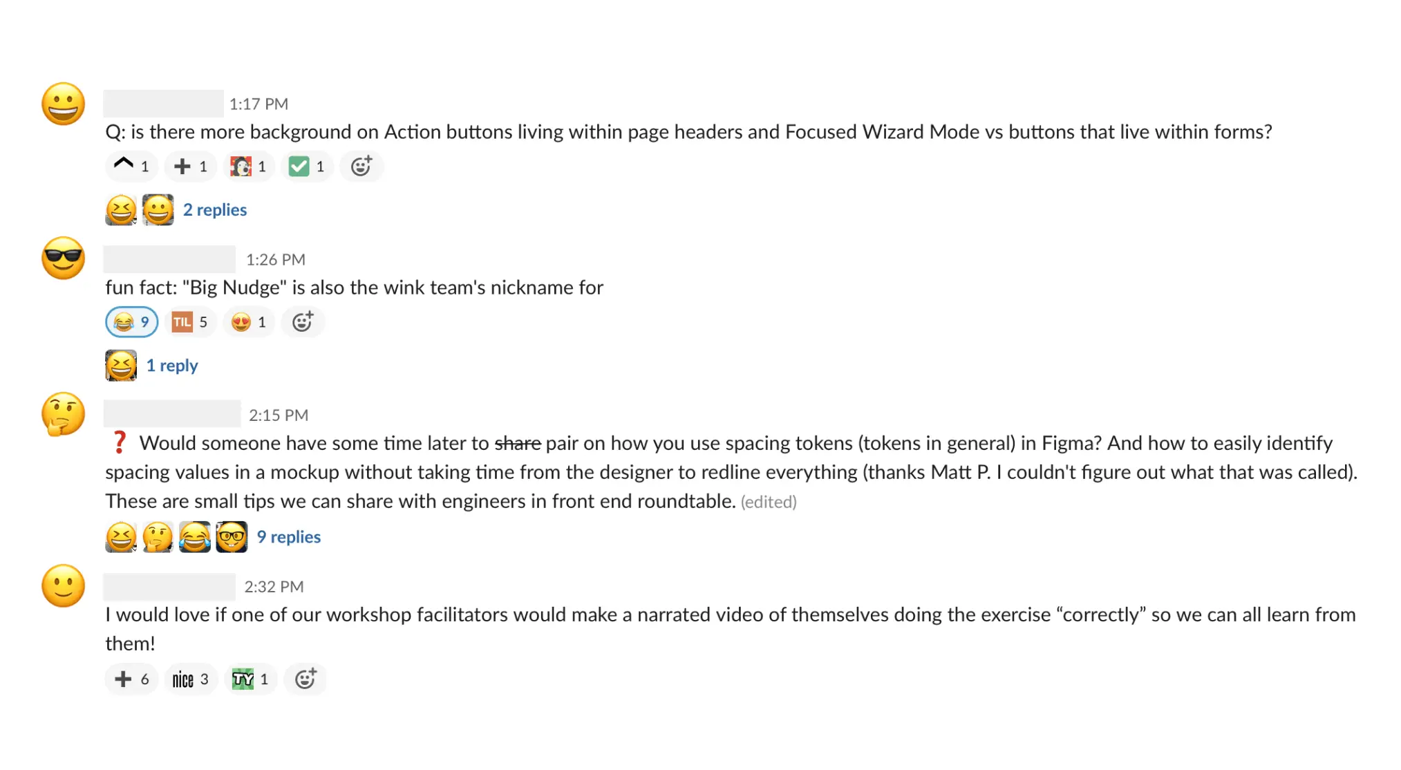
We decided early on that having the workshop live completely in Figma made a lot of sense. We conducted the lectures as well as the workshop activities all in Figma. Figma is where the design system lives – so meet the user where they already are.
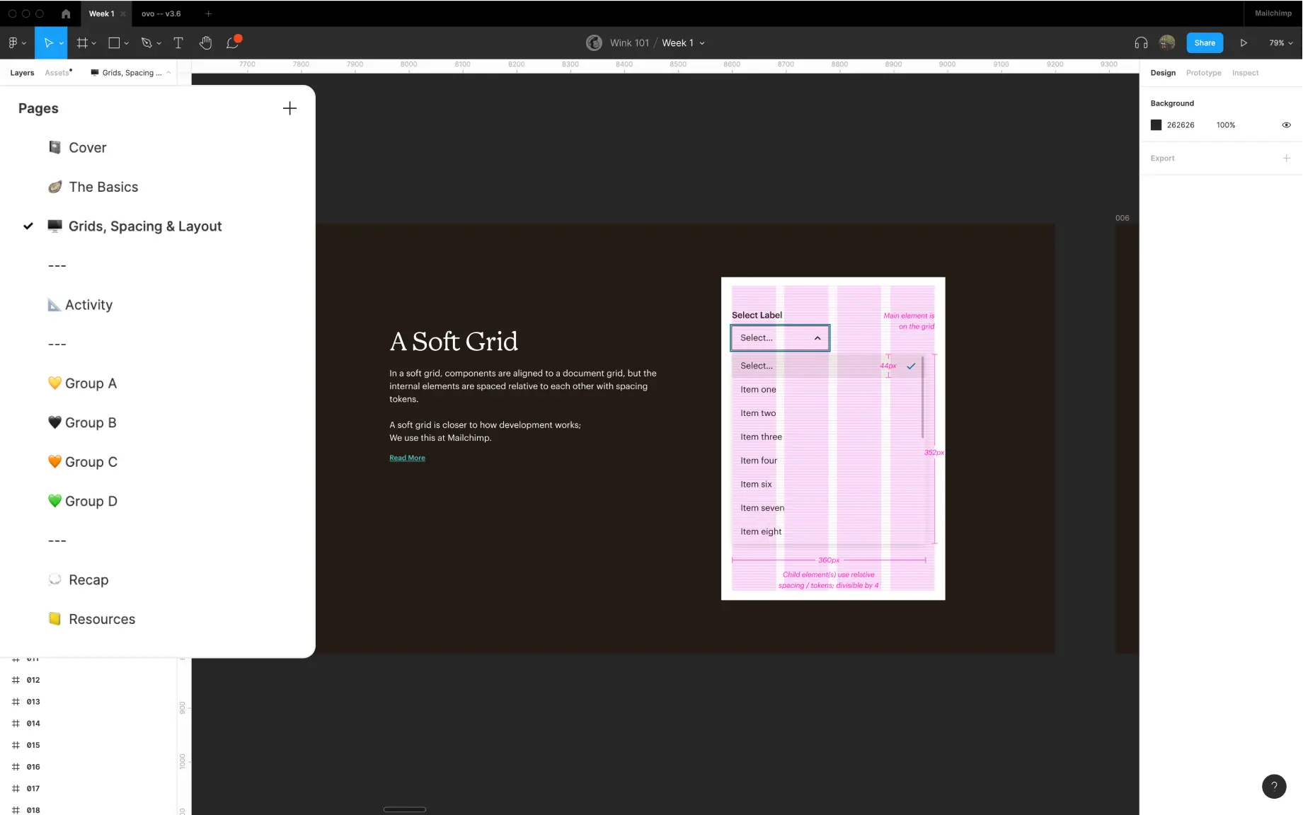
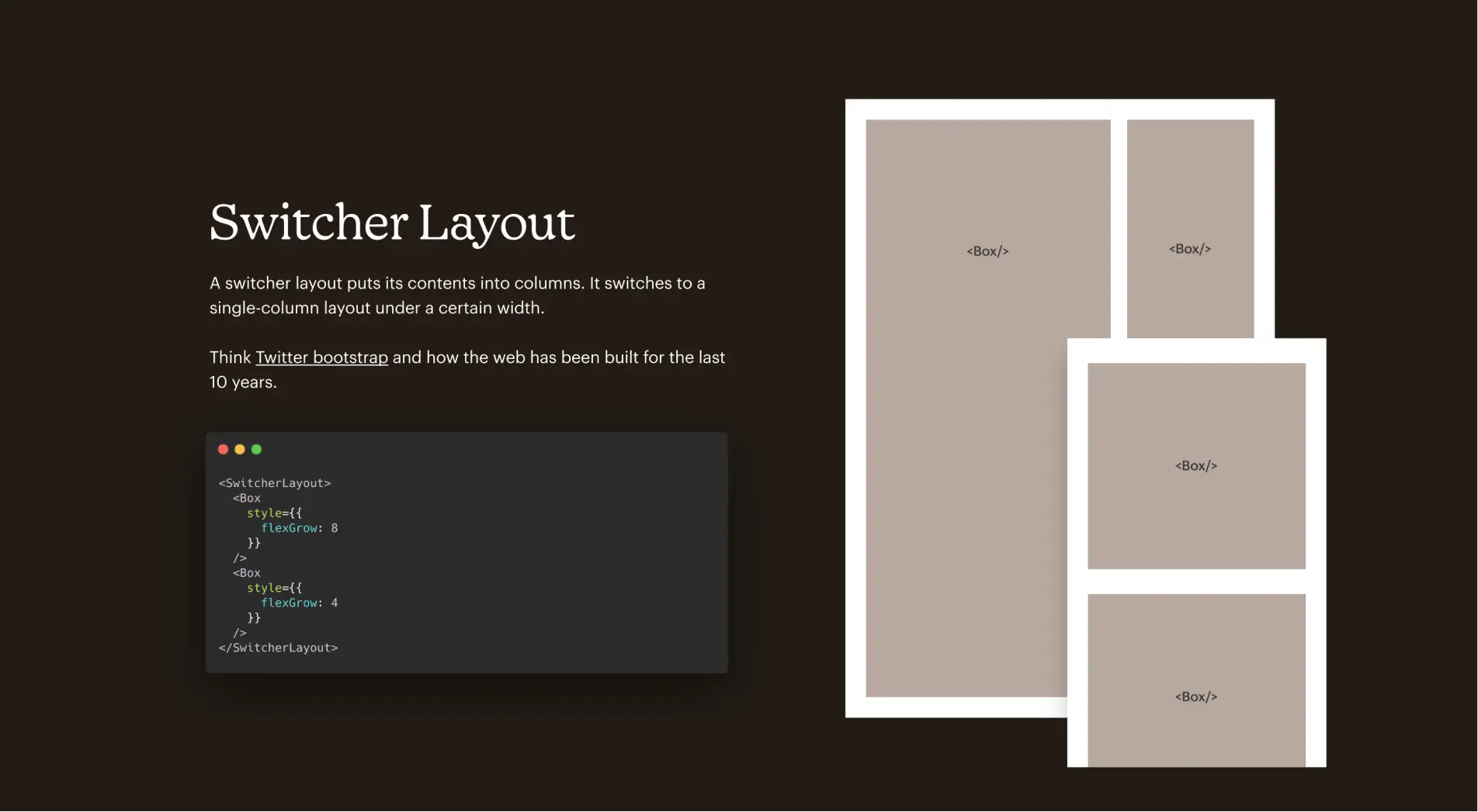
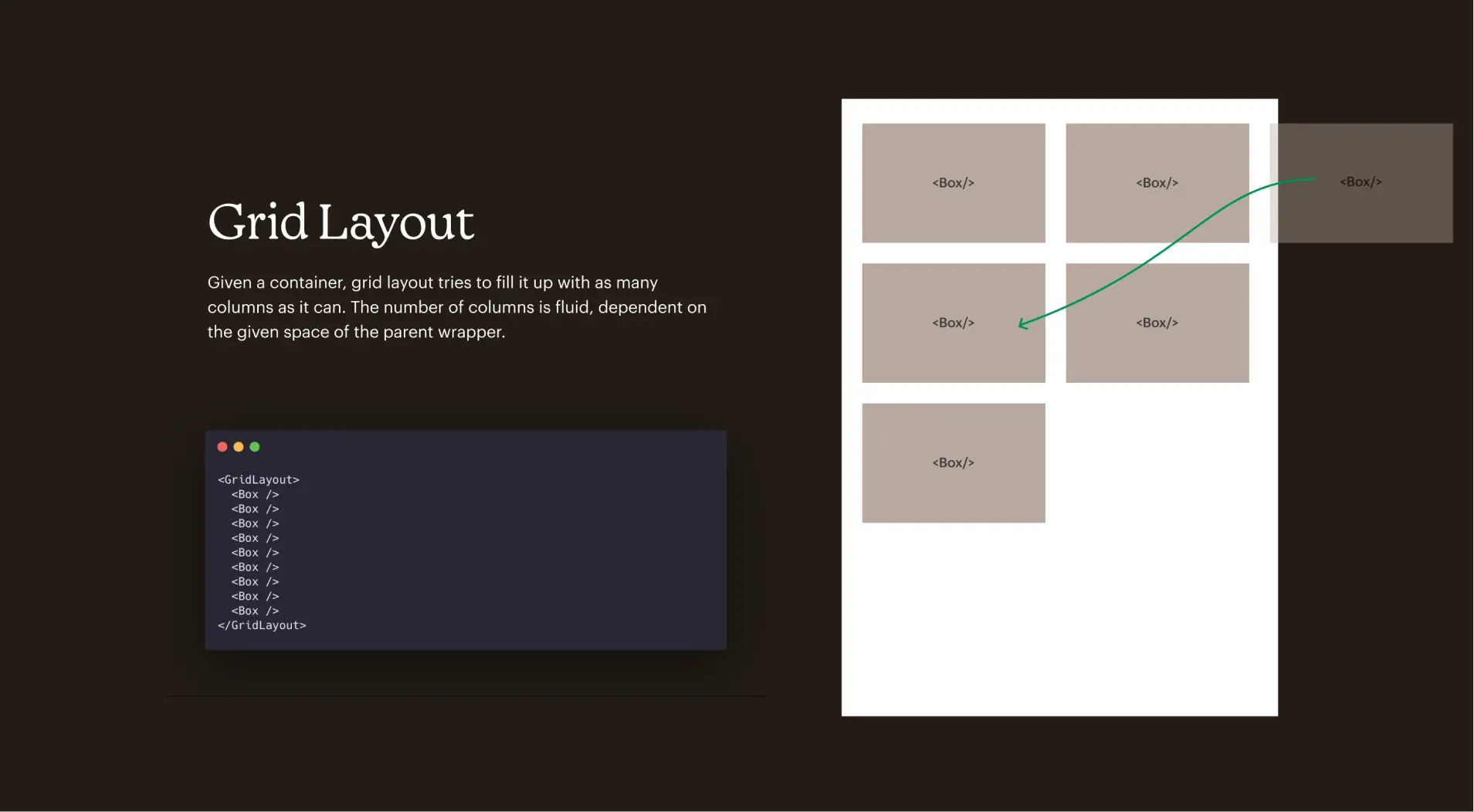
Having a technical background, I thought it might be useful to try and articulate how the layout components engineers use map to some of the auto-layout options we as designers have in Figma. The closer we work in terms of terminology and understanding with engineering, the better.
↬ What difference did we make?
③ While the majority of my focus was for the first week of the workshop, we ran two more sessions facilitated by other members of the design architecture team. All the sessions were recorded and are available for future members of the product design team during onboarding. We set up the workshops so that designers and engineers could easily understand and use the system, all the while communicating how to upstream component requests and changes.