Mailchimp helps marketers send over a billion emails per day, but as small businesses grow and evolve, the need to reach the right audience at the right touchpoint changes. Part of my time at Mailchimp has been spent working on how we'll support users as they mature into the product—using features and tools that complement and integrate with the core product offering, email.
↬ What prompted us to reimagine this experience?
① In the fall of 2020 Mailchimp unveiled their new website builder – a departure from the core product: email. Customers, accustomed to a certain workflow, found themselves navigating an entirely new creation and editing experience. And this was a repeated pattern. Every marketing touchpoint came with its own unique creation process, requiring customers to rewire their mental models time and again.
↬ Where did we start?
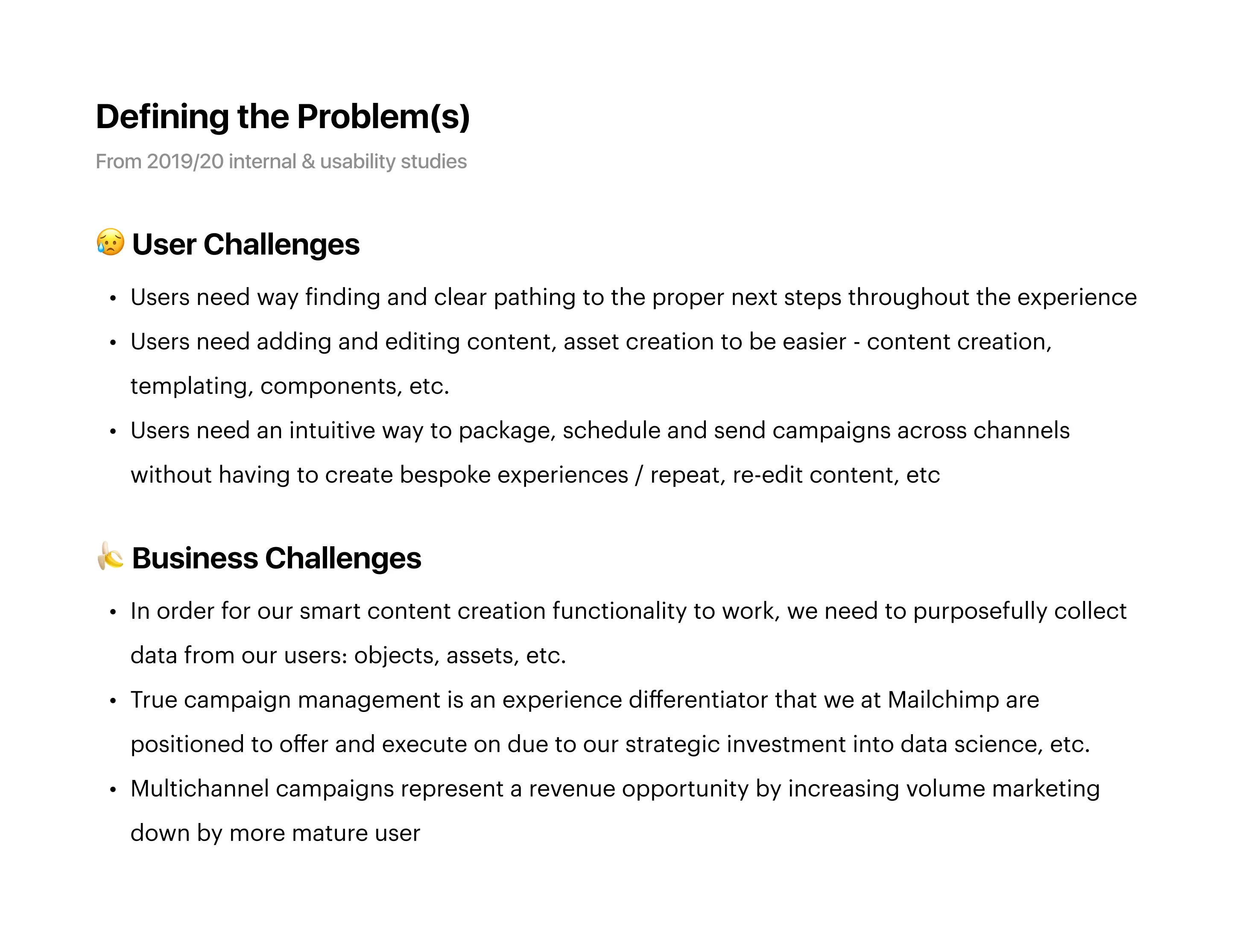
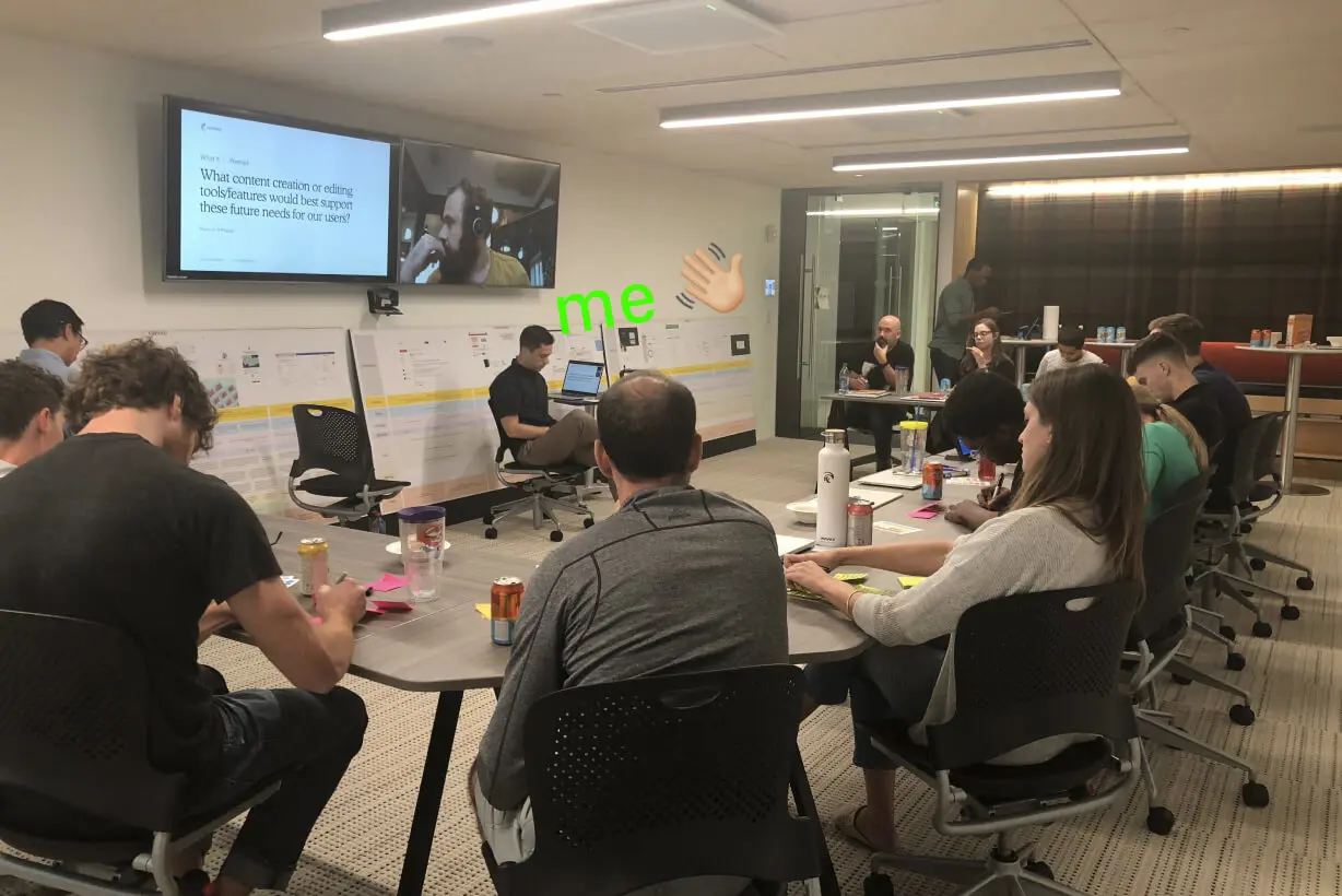
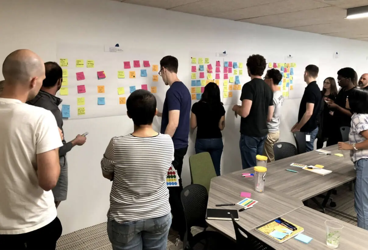
② My first tasks were working with research and product to define user needs and business challenges. I then facilitated a design studio with cross-functional peers to create alignment and generate ideas; inclusivity 🤲.
↬ What did we do?
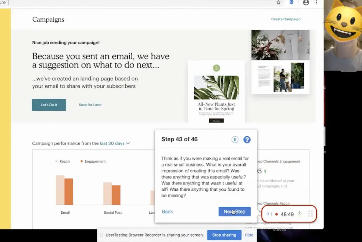
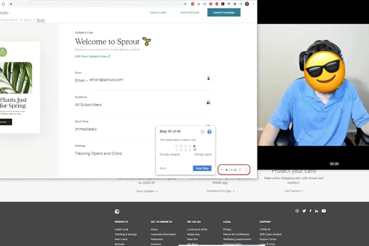
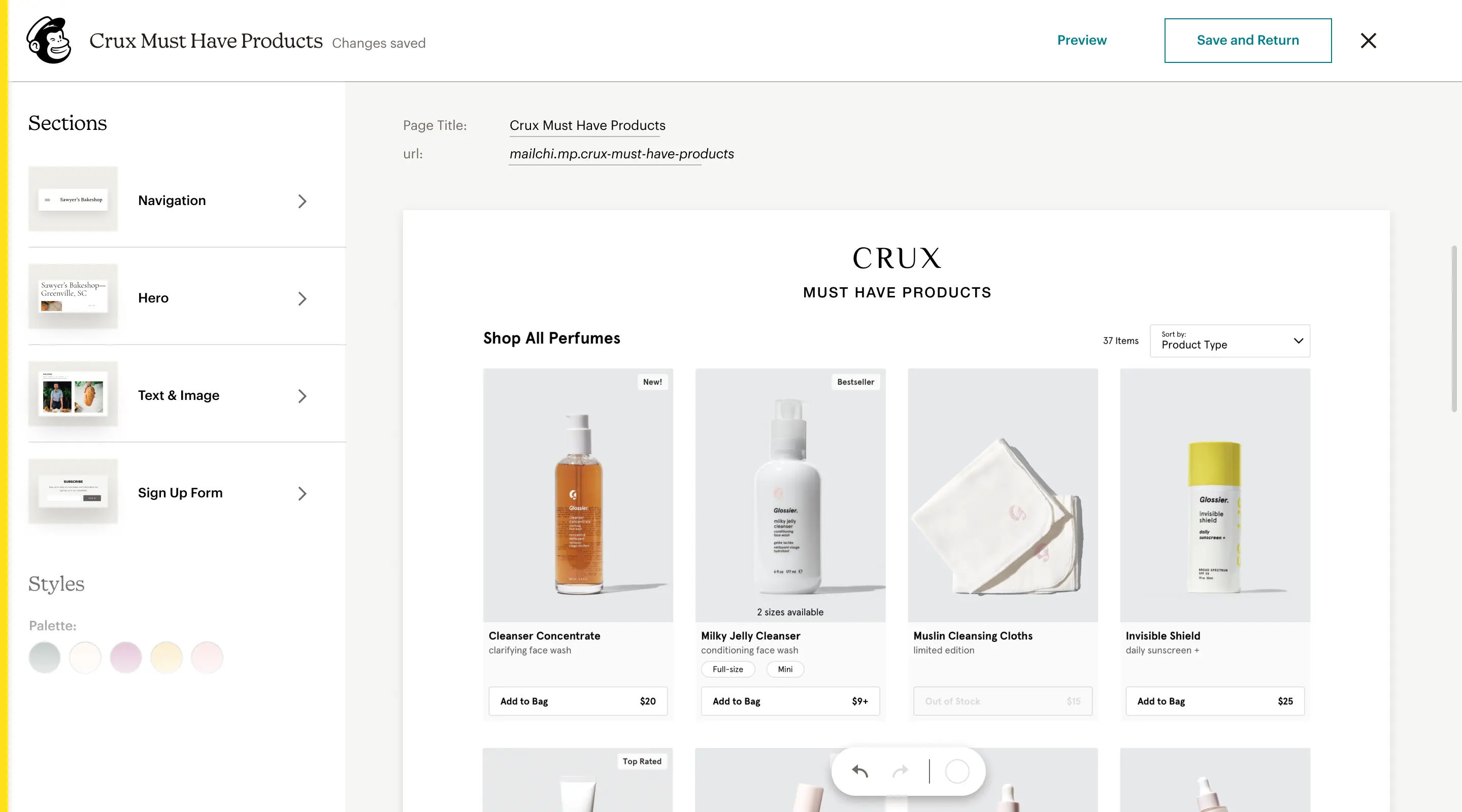
③ After defining the primary red routes, I began prototyping to try and validate the direction I was going. Sometimes I find static mocks to be difficult to really get a sense for how the experience might feel. Prototypes also help give context when sharing with internal and external folks – a prototype is worth a thousand meetings.
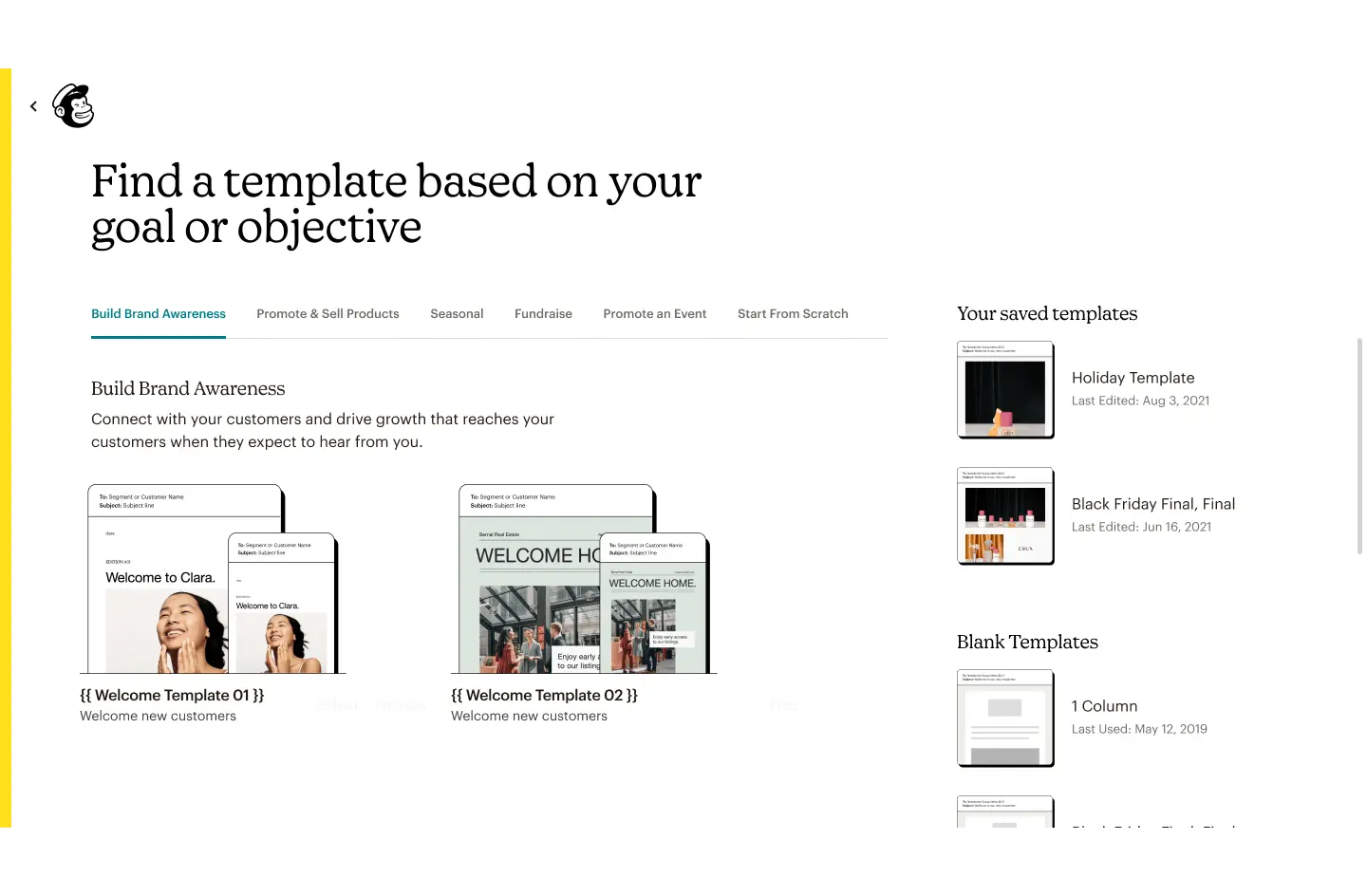
Seen below are initial concepts for one flow. You can see me exploring shared element transitions as a proxy for wayfinding. It also works from a storytelling perspective as you have these pieces that travel with you throughout the journey, which eventually are sent out into the world.
↬ What difference did we make?
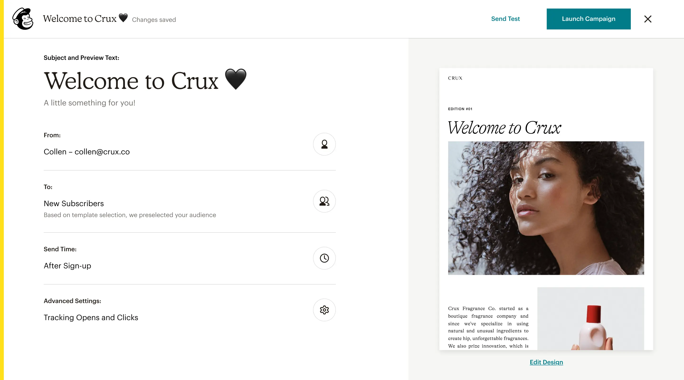
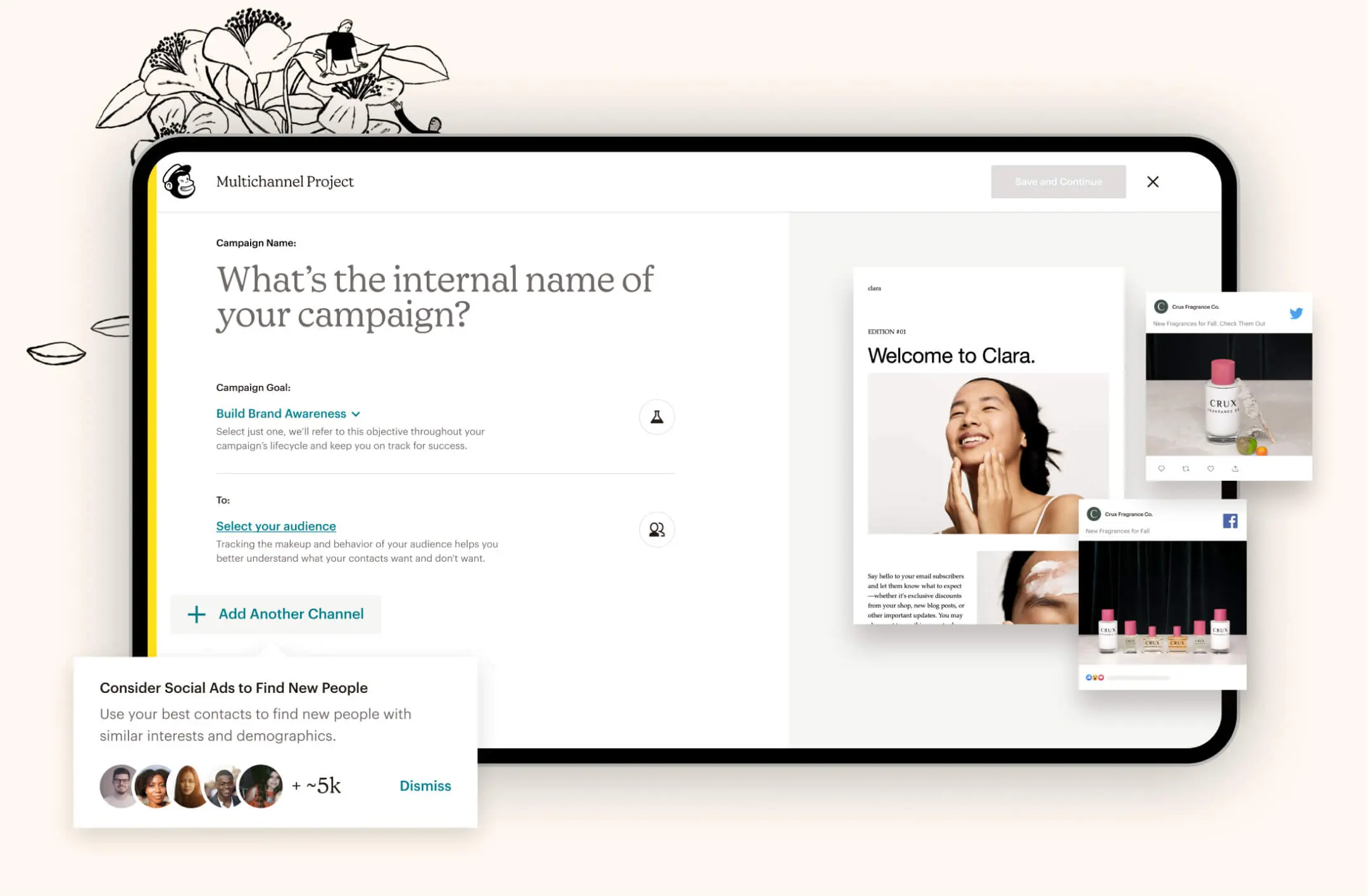
④ While this is just an abridged showcase of the crazy amount of work that went into this project, I’d be happy to extrapolate and share more if you’re curious. After settling in on a visual direction, I began prototyping in react to test the design with users.
Some insights of the old vs. new experience: “...researched show 5 out of 7 people failed to send a campaign. With the redesigned effort, customers now have a 85% on average success rate for sending a campaign.”